Brand Guidelines
These guidelines were created to inspire you when creating brand communication and graphic expressions that are cohesive and convey who we are, what we do, and how we add value. Stick to these guidelines to make our brand loved and recognised globally.

Logo
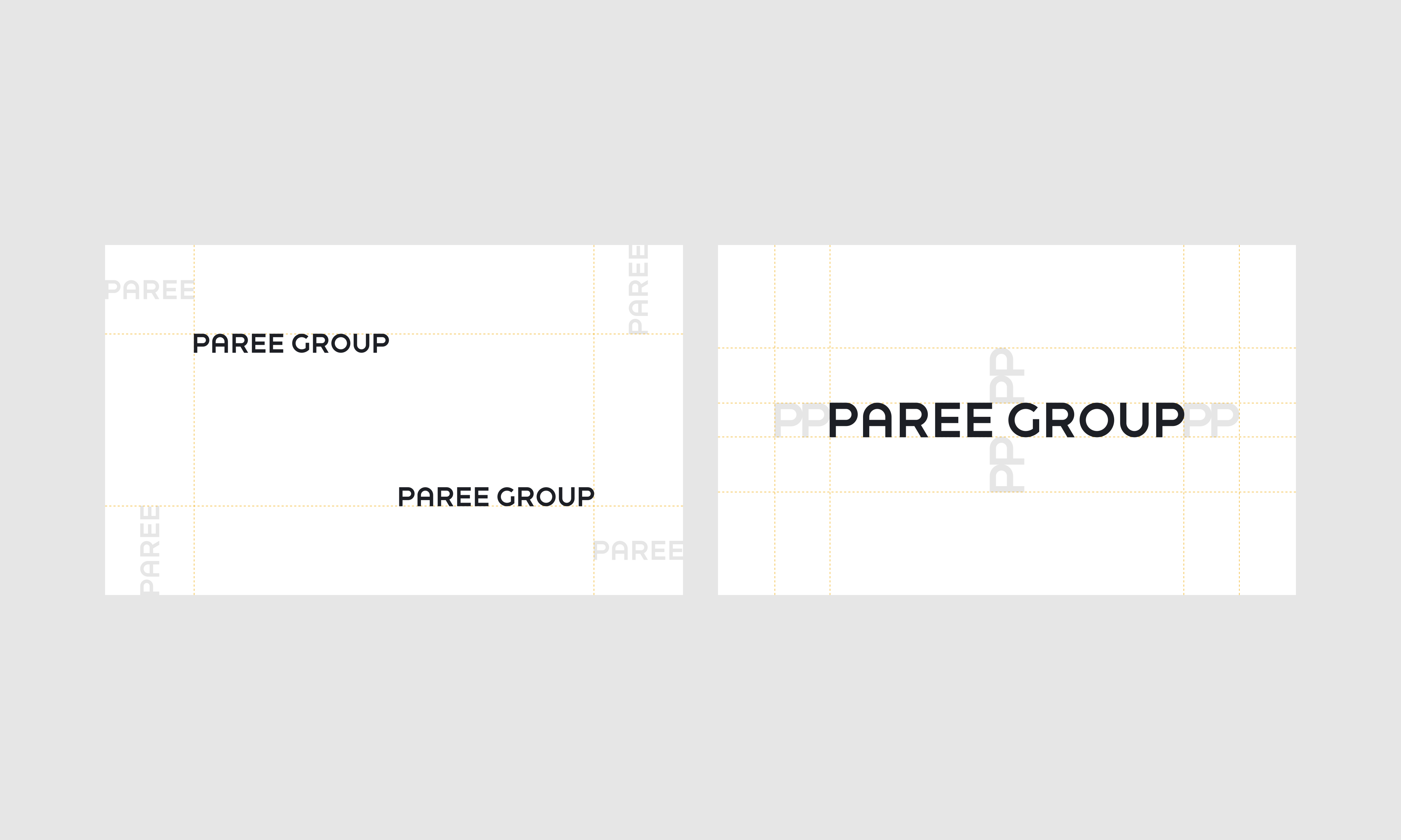
This is our logo. The logo can be used in black or white. Please use the logo against solid coloured backgrounds. If the logo must be used over an image, always stick to the white logo. Please do not alter the logo by adding effects or modifying the letters or its proportions in any way – we like it as it is.

Logo
Usage
Please leave sufficient spacing around the logo. The logo should always be placed in one of the corners of the layout, preferrably in the upper left corner.

Make sure you have the latest logo files in use by downloading the assets from the link below.
Typography
Brand Typography
The typeface used in our graphic expressions is Theinhardt, a grotesque sans-serif. Theinhardt is to be used in all printed stationary, digital advertising and our website. Use Theinhardt Light for headings and Theinhardt Regular for body text. Make the design airy. Use left aligned text placement. Take care of readability as well as clear messaging.
Our fallback system font Arial is to be used when the usage of Theinhardt is unnecessarily difficult or it is not available such as in internal documents or in a newsletter.

Color
Brand Colors
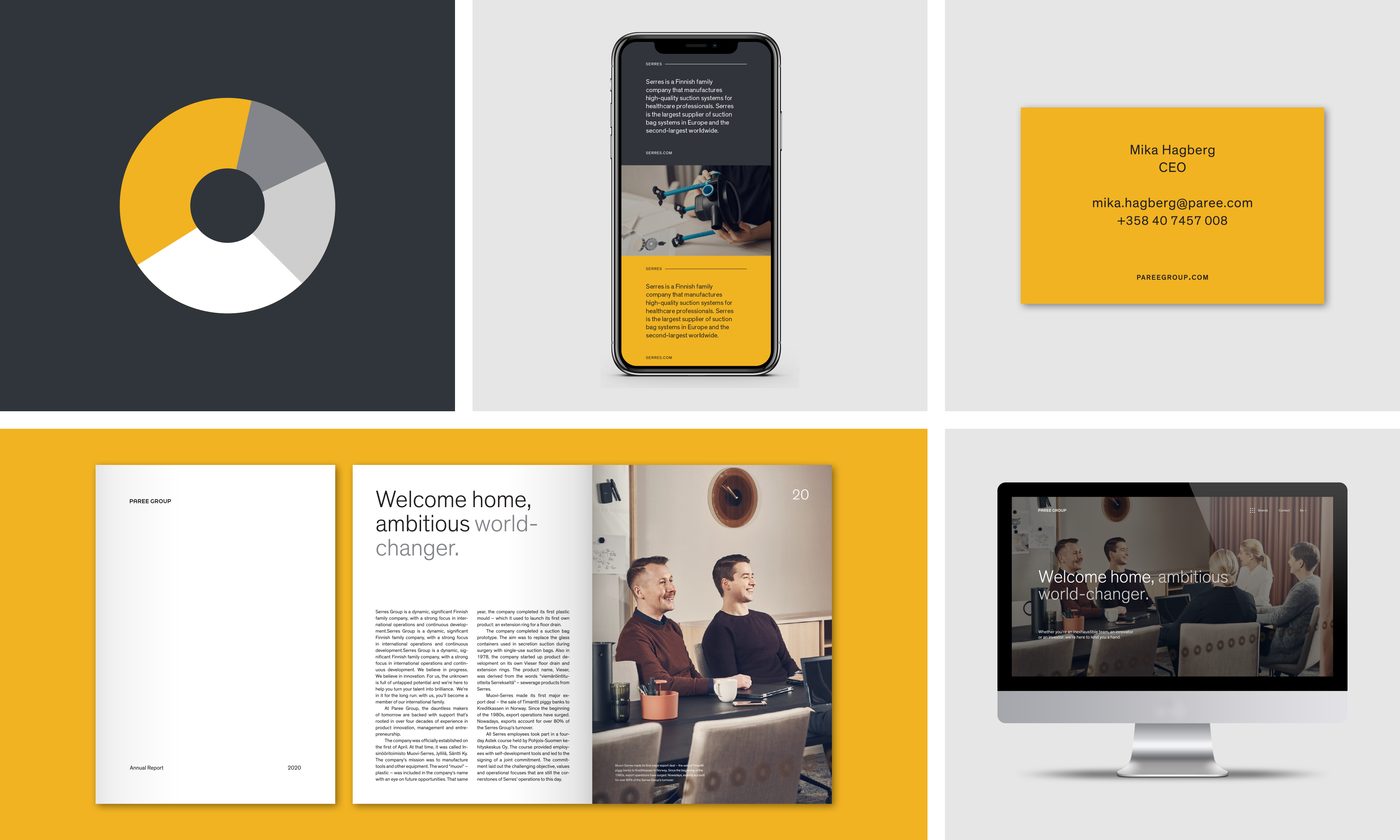
These are the colors that make us look great. Our color palette consists of warm and neutral colors that are also present within the images, leaving the rest of the identity solid black and white. Yellow is our primary brand color that can be used subtly for emphasising information. The additional colors are different tones of grey.
-
Warm yellow
CMYK 0 19 100 0
PANTONE 116 U
RGB 241 179 35
HEX #F2B323 -
Black
RGB 29 32 38
HEX #1D2026 -
Dark Grey
RGB 49 53 60
HEX #31353C -
Medium Grey
RGB 131 134 138
HEX #83868A -
Light Grey
RGB 206 206 206
HEX #CECECE
Images
Brand Imagery
Our image style is recognizable by its warm tones and laid back mood while still communicating professionalism and expertise. It reflects our approach to working with the companies in our group and being committed to working closely with people.
Brand Expressions
An overview
We have a clear identity wherever we express ourselves. Clarity comes from not using too many styles, sizes, colours or messages at once. Sticking to these design principles helps creating coherence and brand recognition across a lot of different touchpoints.

Contact
If you need any assistant working with these guidelines do not hesitate to contact
brand@pareegroup.fi
